I joined as a senior product designer with one junior teammate. There were no source files, no mapped user flows, and no scalable design language. What existed was screenshots of a Xamarin app and a $75K external redesign proposal.
Blocked byNo source files, no mapped user flows, and a $75K agency proposal already on the table.
The first obstacle was that nobody could see the product. There were no source files and no mapped flows, so I worked with developers and the product owner to reconstruct every journey by hand, until Home Credit Vietnam had its first complete visual map of the mobile app.
The map was the tool the next move needed. Within one week I used it to prototype a credible alternative to the agency proposal, and the work earned CEO approval for us to build the new app internally.
Before
After
Screenshots of a Xamarin app
Reconstructed every journey
No source files
First complete visual map of the app
No mapped user flows
Prototype within one week
No scalable design language
CEO approval
$75K external redesign proposal
$75K kept inside the business
Home Credit, before and after the redesign.
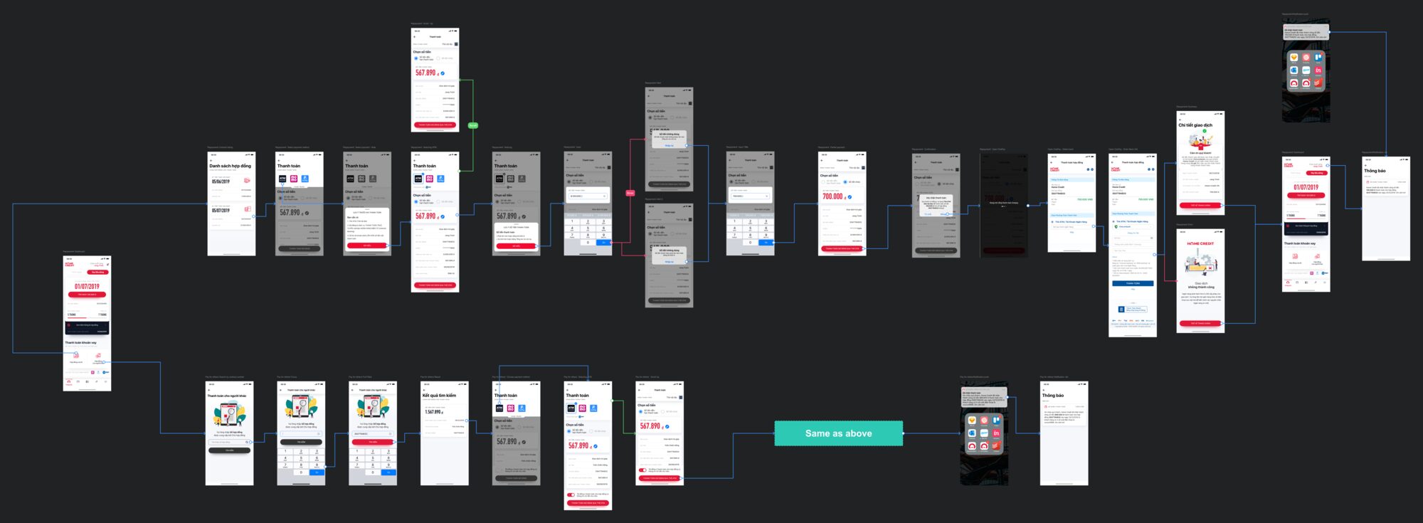
Journey map
One board of the reconstructed app: every screen of the repayment journey, its branches and its dead ends, laid end to end. Illegible at this width on purpose: the length is the argument.
Board by Jang Trịnh, Home Credit Vietnam design team. Source document 02Build foundations
Blocked byA mandate to rebuild, and nothing to rebuild from: isolated screens and a flat information architecture.
The mandate came with no foundation under it. I aligned with Brand and Marketing, studied platform conventions, and created the first design system for Home Credit’s digital products.
We replaced the flat information architecture with a deeper, scalable model. Later testing showed participants completed 80% of the information-architecture scenarios.
Usability testing result for the new information architecture.
Prototype · 2018
A phone-number sign-up and OTP verification flow, ending on the Welcome Kit screen. Built in 2018, it was the first prototype shown to the CEO to win approval for building the new app internally.
Prototype by Jang Trịnh, Home Credit Vietnam; the phone number in the OTP screens is the designer's own test number. Source document
The home screen before the redesign, a plain list of Log in, Sign up and Cash loan, and after: a promotional visual leading with an offer instead of a menu.
Choosing a loan amount and tenor, before the redesign and after: sliders on a plain card became two scrollable pickers, the monthly payment computed live as they move.
The account home screen, before the redesign, a plain menu grid, and after: a dashboard leading with the next payment due, the contract number and how much of the loan is already paid.
The payment screen, before the redesign, one method only, and after: a choice of ATM card, Momo or AirPay, with the amount editable before confirming.
Blocked byA rebuilt app that customers still had no reason to open twice.
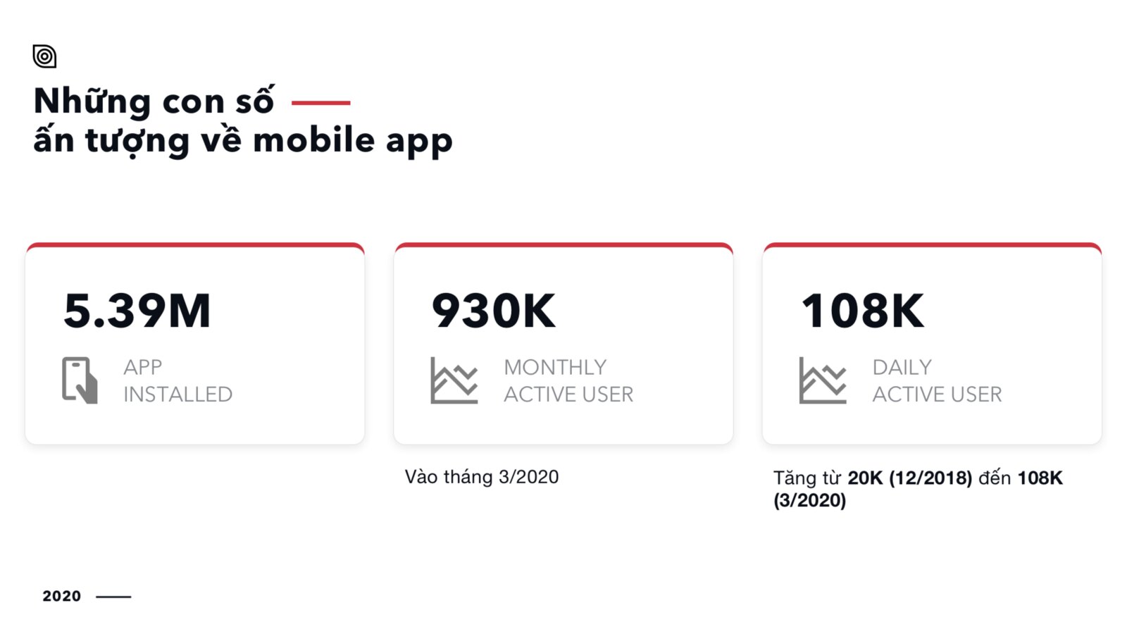
A system was ready and a reason to come back was not. The redesigned app shipped, and gaming concepts went in behind it. Daily active users rose from 20K in December 2018 to 108K by March 2020. Fifteen months of compounding, not a campaign spike.
That engagement fed acquisition and cross-sell loan revenue. A new Welcome Kit workflow cut operational cost by roughly ₫2B.
Client slide · 2020
Home Credit's own 2020 review of the mobile app: 5.39M installs, 930K monthly active users, and daily active users from 20K (12/2018) to 108K (3/2020).
Slide by Home Credit Vietnam. Source document 04Scale the capability
Blocked byEverything won so far depended on two designers staying.
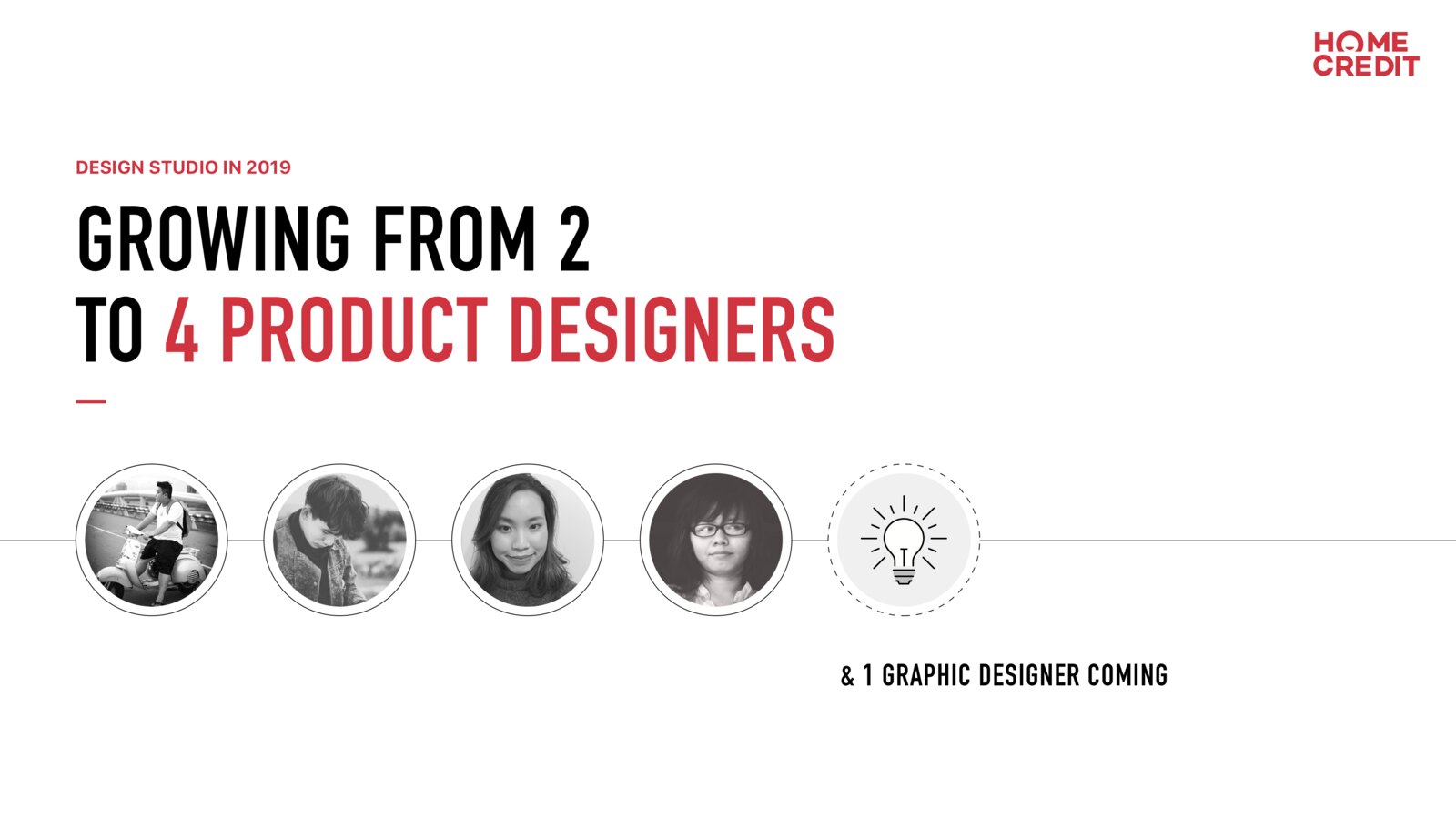
A capability that lives in two people is not a capability. The evidence made the case for an internal Design Studio. I was promoted, grew the team from two product designers to four with a graphic designer joining, and expanded from one product line to six.
The team introduced design sprints and served the customer app, CRM, sales tools, landing pages, education, and internal platforms.
Team & surfaces, before → after
2 product designers → 4, and a graphic designer joining
Team and surface growth after the Design Studio was formed.
Client slide · 2019
The Design Studio case, made in 2019: two product designers to four, with a graphic designer still to come. The four faces are the team the slide was arguing for.
Slide by Jang Trịnh, Home Credit Vietnam. Source document Boards
Every journey, drawn before it was built.
Seven working boards from 2019 and 2020: the flows a growing app actually ran on. Deliberately illegible at this size, since the only thing a page can show of one 22,409 pixels wide is how far it runs, and that is the argument.
The longest board in the set: one journey end to end at 22,409 pixels, with its branches hanging below the main line and its dead ends drawn rather than deleted.
Two registrations compared on one board: v1 asks for a phone number and an optional contract number, v2 for the phone number alone. Both land on one of three dashboards: anonymous, registered without a contract, registered with one.
The repayment journey, also shown in chapter 1. Every screen of it laid end to end, with a green “Same as above” block where a branch repeats rather than a second copy of the same six screens.
The credit-card surface: card list, card detail, card settings, payment history and the transaction filter. This is the product line the app gained after the redesign proved itself.
A journey that leaves the app twice: it starts in a Google search, runs through cart and request, then waits on Home Credit's approval before the customer visits the merchant in person to collect. The merchant's own notification is on the board too.
Not a customer product. The sales agent's own app: a call list of new customers and re-call schedules, a meeting scheduler, and a loop that returns to the dashboard to call the next person.
The concept board, annotated in the margin: where campaigns are allowed to appear and that the customer can dismiss them, which tiles open which flow, and what an un-activated card must say instead of a balance.
Boards by Jang Trịnh with the Home Credit Vietnam design team, 2019–2020. Recovered from the owner's own archive; screened before publishing.
Prototypes
The app was designed as motion first.
Seven prototypes, recorded before any of these screens were built. They were how a flow got argued: with product owners, with engineering, and in the room where the CEO approved building the app internally.
2019 · The returning customer, with biometrics offered beside the form.
2019 · Dashboard to a paid instalment, ending on a receipt.
2019 · The same payment, entered from a push notification.
2019 · Turning online payments on for a credit card.
2019 · Asking for notification permission, and the state when the answer is no.
2019 · The confirmation arriving, on a real phone.
2019 · The dashboard opening into the contracts behind it.
Prototypes by Jang Trịnh, Home Credit Vietnam. ProtoPie and Principle, 2018–2020; the account and contract numbers are the designer's own test data. The strip scrolls sideways.
Reflection
We moved quickly and initially relied too much on benchmarks instead of foundational research. The lesson stayed with me: speed can earn the right to continue, but evidence must eventually replace assumption.